Background 📋
Before we dive into the product, we should probably understand the goals of Advisar, a child company of it’s parent, Masonite - a global builder of doors.
Masonite is in the business of manufacturing and selling high-volumes of doors to distributors, such as The Home Depot and Lowe’s.
But in 2017, Masonite wanted to begin testing products downchannel to contractors and homeowners - so they formed a small internal incubator that would serve as “beta test” with a single goal in mind:
To identify numerous attributes of the customer experience to better understand the value and buying behaviors consumers and contractors associate with specifying, ordering, designing, finishing, delivering and installing door systems
I joined the Advisar team in early 2019 as the sole designer on a development team made up of 8 engineers, a development manager, 2 QA engineers, and a product owner.
My first project was to tackle our exterior door configurator experience, which had built up a mountain of design/tech debt from months of ad hoc business requirements and a research-less process. Like many products, our design challenge was to answer how to make configuring a complex product simple for our users.
I was tasked with the redesign, user research, and validating the product strategy. I thought this would be a great project to implement Google Ventures' Lean User Research framework - with the small size of our team and a large amount of work, it was important that we validate ideas before moving forward.
After starting design ideation and research in June 2019, we worked through the year to ship the new version in late December 2019.
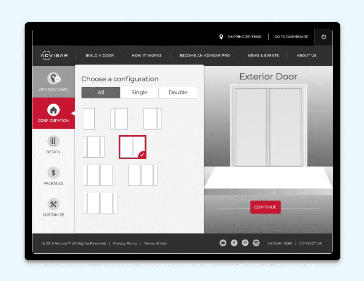
What is the Exterior Door Configurator? 🚪
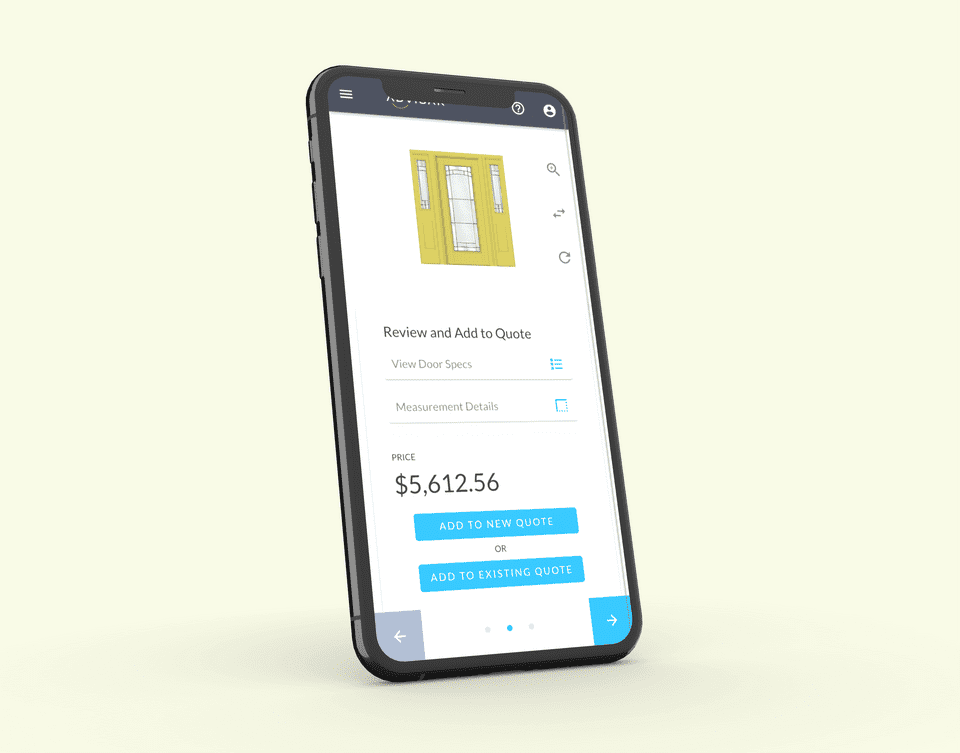
The exterior door configurator is an app that allows our users to build a custom door and quickly assess their new door per their unique specifications.
After configuring a door, our contractor clients are able to add the item to a lead/quote under the Advisar platform.
Discovery and Research 📝
Before jumping into a complete redesign of the configurator interface, we needed to assess why the current interface was struggling to scale for our clients - home-remodeling contractors.
We needed to dive into the sales process of our users, the problems our users were having in the current interface, and the reliability and performace issues of the app.
Pain Points
We also discovered from our contractors that an exterior door is usually a "tack-on" to a home-remodel. A majority of the time, a door is secondary to other major remodels, eg. kitchen, patio.
Knowing that, we made sure to remember that we wanted the experience of this app to be somewhat transparent and simple - contractors and homeowners had more pressing matters on their mind with a remodel project, so we needed users to be able to find what they want quickly and move along.
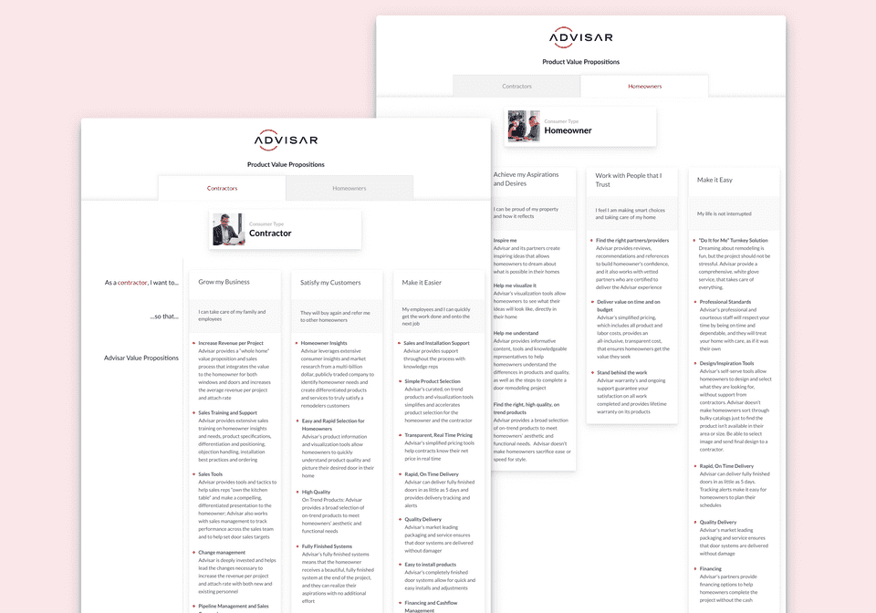
Use Cases 👩🏫
Our research and qualitative interviews identified the use cases for our clients:
I am a Contractor and I want to build and purchase a door for a client.
I am a Contractor and I want to show my client a door they can purchase through Advisar.
I am a General Consumer and I want to build and view a custom door.
Goals 🎯
Our high-level goal for this project was to understand door-buying patterns, as well as simplify the ordering/customization experience.
After digging through our research, we also wanted to address a few other goals through our redesign:
- Sensible defaults for a simpler experience
- Give higher priority to certain options (e.g. Color, Glass, Style)
- Utilize a non-linear configurator pattern for faster configuration
- Prioritize the discoverability of options by showing disabled options
- Standardize user interface styles to better match the core application
- Optimize configurator for use on tablets and phones
Design Ideation 👨🎨
Now that we understood the pain points and defined what we wanted for the experience of the configurator, we began iterating on the design.
One of our major goals, realized through our user interviews, was that consumers prioritized some options more than others. Glass, Color, and Design far outweighed other options, such as molding, jamb depth, and hardware. By giving higher prioirity to these options in the interface, we could allow for better context and promote the discoverability of our product options.
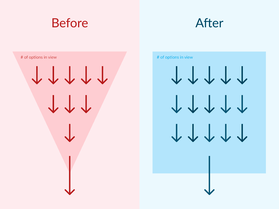
We also wanted users to be able to select and choose options from any point in the configurator. Previously, a user would funnel down selections - where the UI would remove further options based on if that option was compatible. If a client wanted to choose between various options, they would have to click many steps back and proceed forward step-by-step, once again 😭.
Strangely, this also meant we had to break a UX pattern in order to provide a better experience:

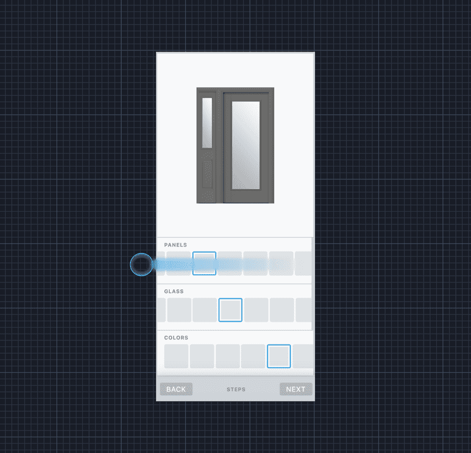
Each of our presented ideas split the door building process into 3 major steps, rather than the multitude of complex steps in the older version:
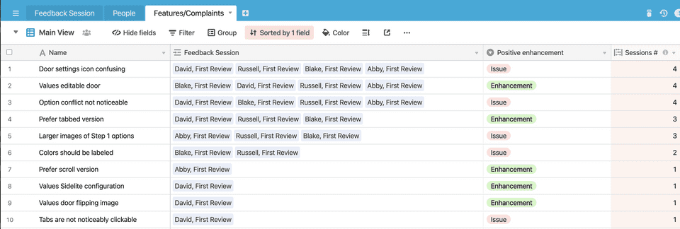
To test these ideas before development, we began testing sessions using Figma prototypes - first with our internal teams, and subsequently contractors. We used Airtable (👍) to keep track of feedback, where we found areas of the product that were confusing to our users.
The Redesign ✨
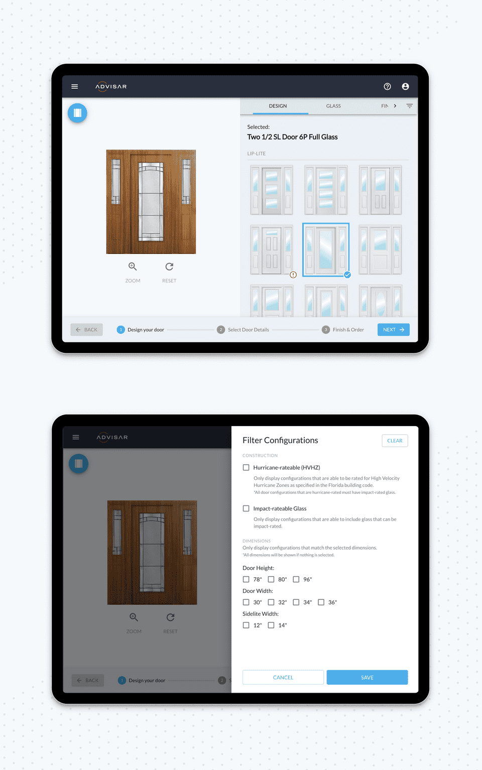
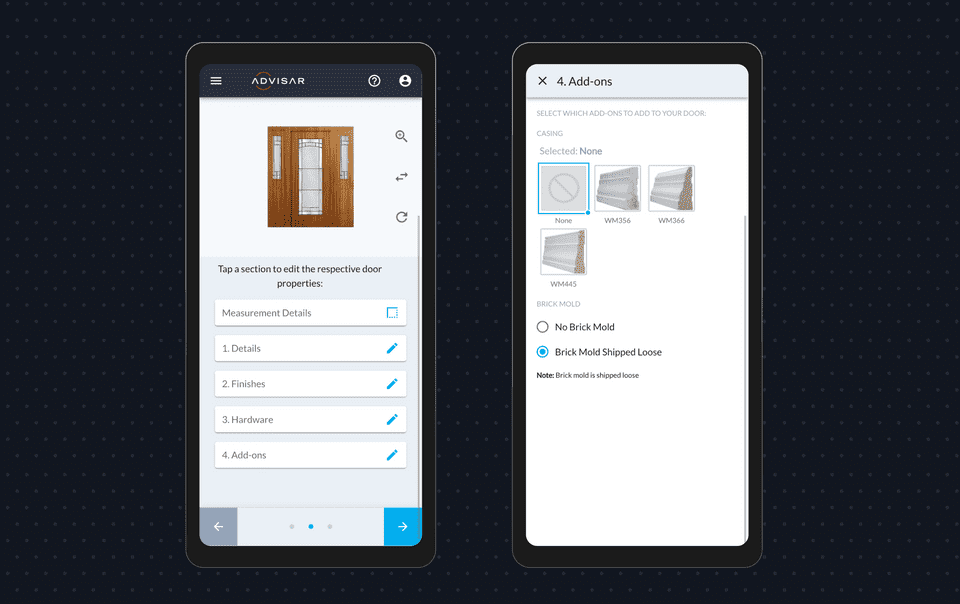
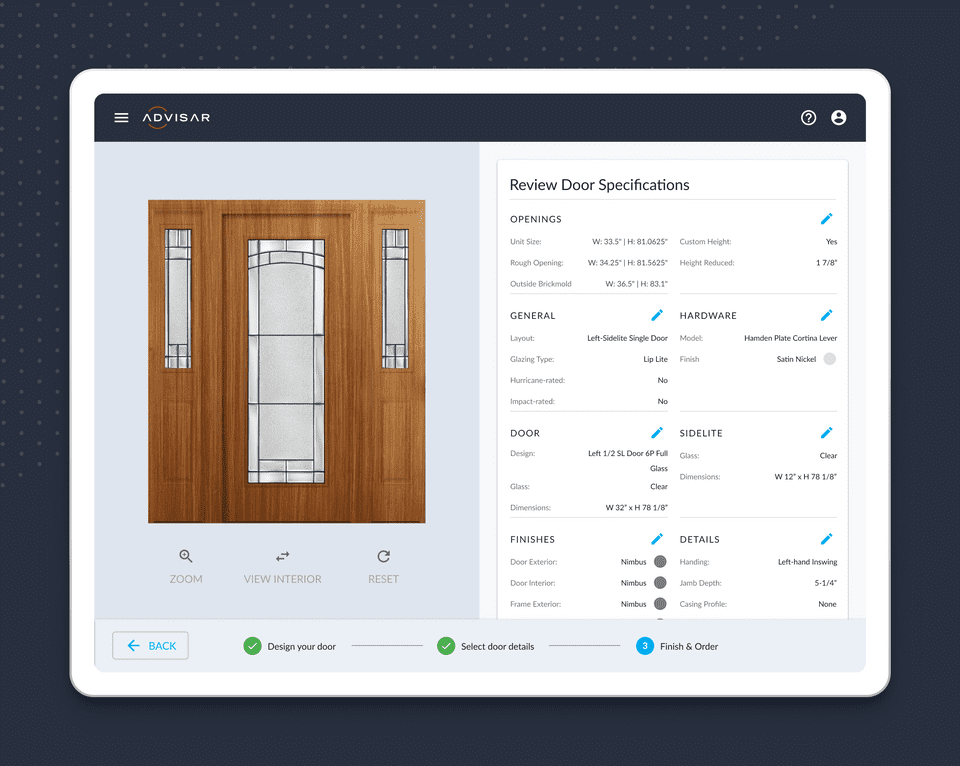
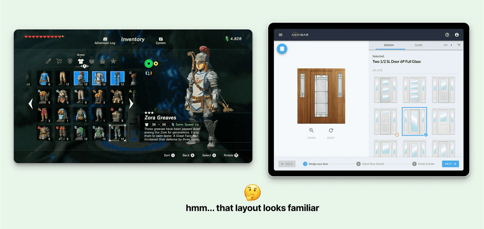
After iterating on the design, we dialed down onto many decisions that would help make building a door simpler:
Sidenote: this game includes some great design affordances and possibly one of the best onboarding experiences I've come across in an app or game
Key features 🤩
After shipping the first iteration of the configurator, there were still friction points holding back contractors from ordering products.
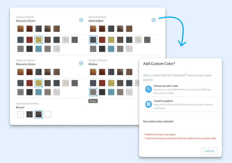
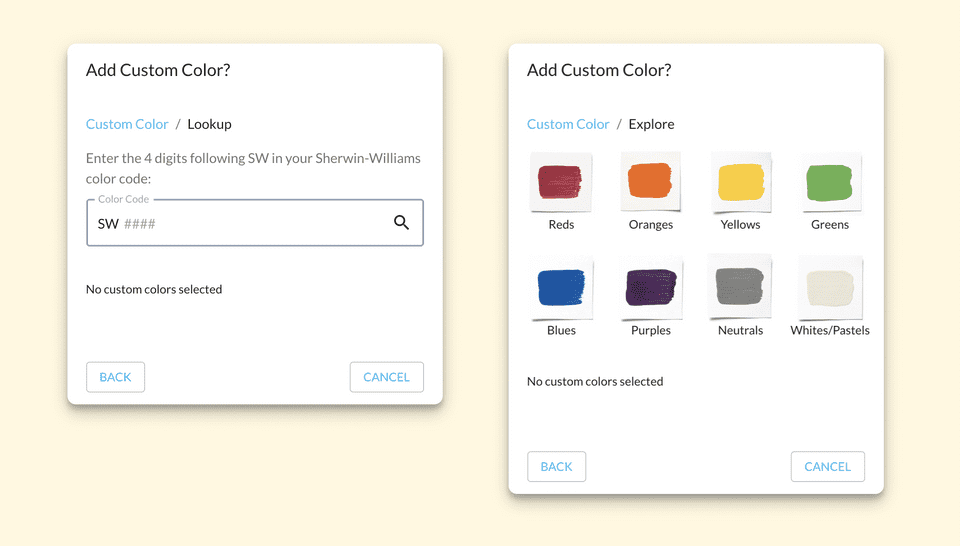
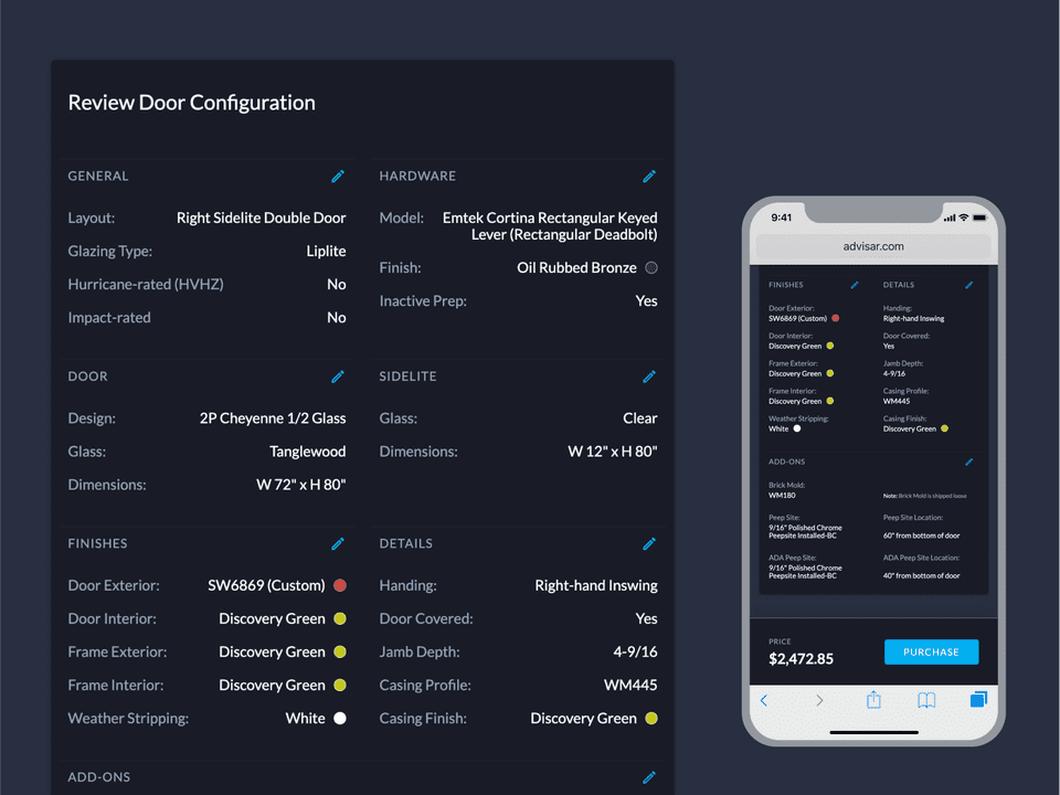
Our color/finish offerings were limited, and customers needed a way to paint their high-quality doors with more options, per their preference or HOA requirements. Understanding that, we needed to know how contractors not only receive the Sherwin Williams color information, but also figure out how this can be integrated into our fixed-option layout.
Sometimes HOA's give a list of color codes that are able to be used in their neighborhood, but other times, users may choose to explore options - so we needed to design a flexible way to navigate through either path.
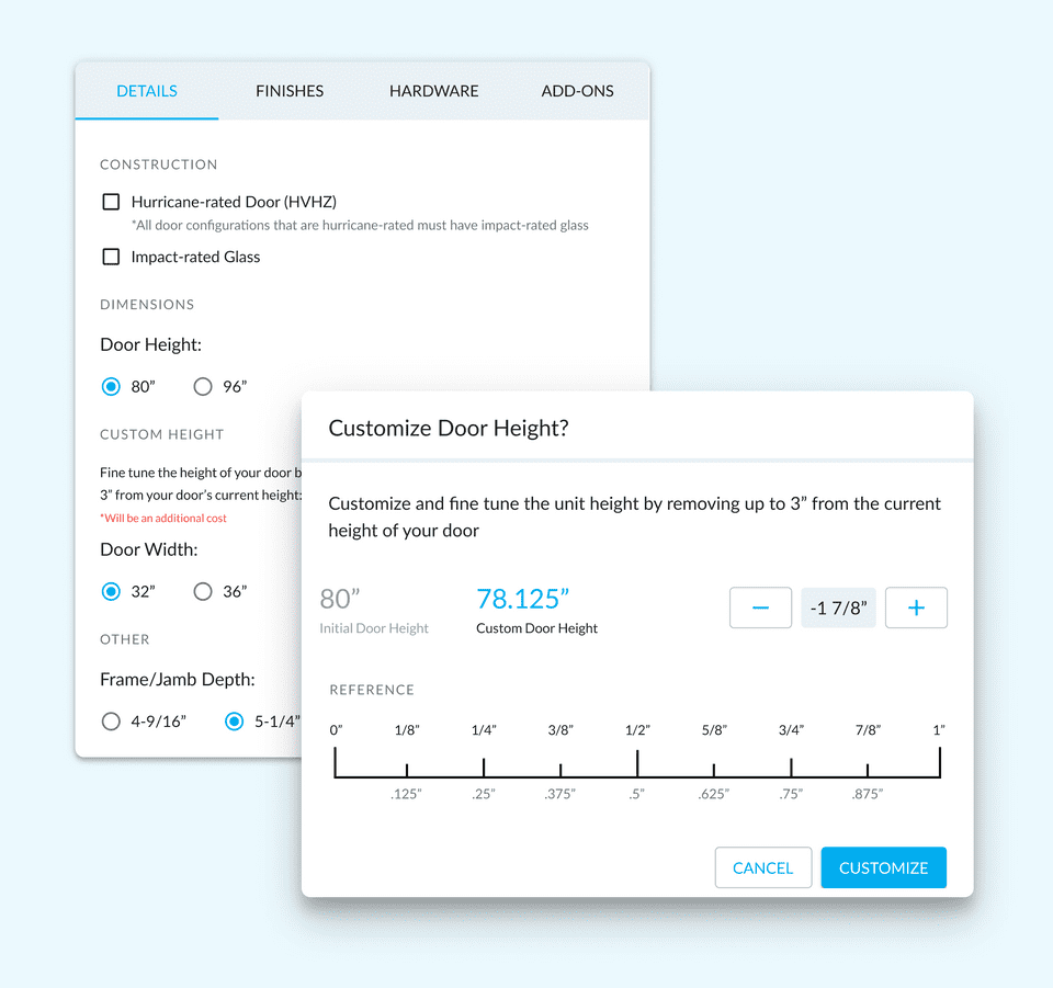
What if a homeowner's entryway size doesn't match one of the fixed door sizes in our offerings?
This was something that was also holding back contractors from using our configurator. We needed a way for users to be able to fine tune the height of a door per their clients' various entryway sizes.
Along with reconfiguring our operational and manufacturing procedures, we also added a way to trim a door by units of 1/8", up to 3".
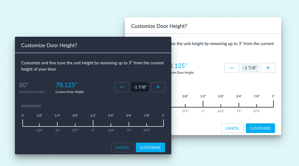
The design for the new configurator also coincided with the redesign of our core application. With that came a redesigned dark mode that rectified UI inconsistencies and usability issues.
Feedback 💬
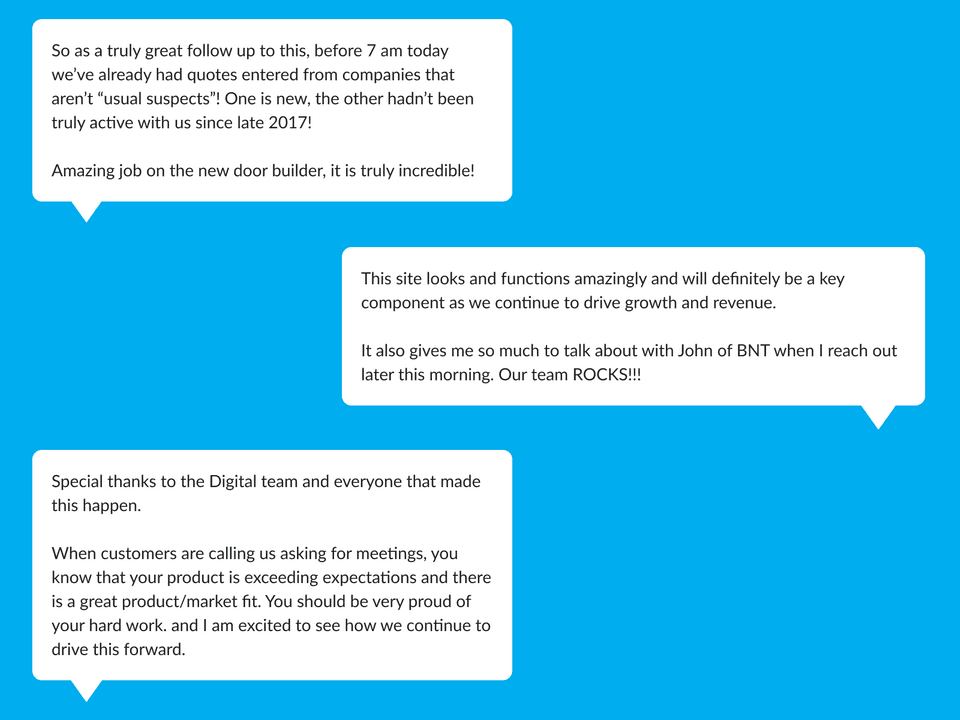
After rounds of QA testing and usability polishes, we shipped the new configurator in late 2019. We immediately received feedback from our clients and support teams, and to our surprise, it went very well.
But even though praise is great and should be celebrated as a job-well-done by the team, I thought we should take a closer look into the feedback that was poor - from those whose processes were disrupted because of "a completely new way of doing things". Dealing with change can be difficult - we’ve all experienced it 🤷♀️.
How do we accomodate for users experiencing change aversion?
In order to bring the users who were averse to the new UI, we decided to provide transitional support through our launch. Dedicated feedback channels and an online support center helped us distribute our knowledge base. We also began a continued effort to track attitudes regularly through feedback loops, sales training, and customer support.
Takeaways and Next Steps 💡
Measure outcomes not output: It seems as though traditional development teams have a bias for measuring on quantitative output, rather than how successful a product lands with a user group. However, this project has taught us that the speed of the build should be less important than "what we build" and "why we are making it".
Introduce users early: I learned that if we begin testing and asking the right questions earlier, we're able to fail fast and more rapidly nail down which solutions work and which don't.
Design incrementally: We saw a huge amount of success in introducing features in small increments, rather than large sweeping changes. Doing this allows us to avoid changing our users' processes while still making our configurator more feature-rich.
Design Thinking as a team: This was my first project, and Advisar's first foray into using an iterative design process. Working solo, I needed to come up with a way to introduce a design process that works alongside the engineering team's agile process. See what I came up with!
Amongst competitors, we made a giant leap from a step-by-step configurator pattern, to a version that flattens the model and lets users index any option from any point in the process.
A huge shoutout goes out to the team on this one 👏! I'm a solo designer on the team, but it's a true luxury to be able to design while also gauging development and business constraints in realtime. See how we implemented this in conjunction with our core application!
Thanks for reading!
If you'd like to see more work, head back to view all work or check out one of my selected projects:
Back to Work