About the project
Help users personalize their Slack workspaces by browsing through an easy-to-use interface
Notion, Figma, Firebase, React, Styled Components, Google Analytics, Google Forms
I wrote about how I built Slack Themes!
Slack is a communication and chat tool that helps teams work better together. Inside the app, users are able to configure the theme of their sidebar by choosing from the handful of themes default Slack themes.
Since I'm somewhat of a Slack workspace connoisseur hoarder, I found I needed to differentiate my Slack workspaces from each other and that using a different them could help with that issue.
But, in order to change a theme, I had to go through multiple steps: open the menu, click preferences, change theme.
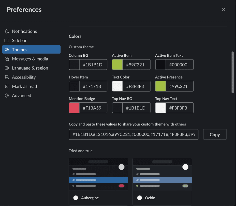
How can we make the process of selecting themes simpler?
What if a user wanted to do this in less steps?
What if a user wanted access to more theme options?
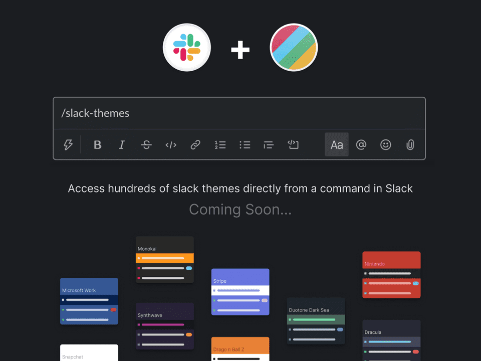
What if users could access and query themes directly from typing a Slack command?
🎯 Goal Setting
The idea of building a simple app was tempting - I could not only help alleviate some issues I encountered, in a fun way, but I could also use this experience to learn how to design/build using a few newer technologies (automatic deployments, CSS-in-JS, Firebase).
So my goal was to design & build a simple, free, and straightforward experience for users to find and implement a curated Slack theme, even if they are not Slack-savvy.
Help Slack users differentiate and personalize their Slack workspaces through a simple, configurable interface
While working on personal projects, it's tempting to fall into Blue Sky ideas, where I could add unnecessary features, but would detract from the goal of keeping the product simple.
So I would regularly stop myself to say:
Which of all possible features are going to add real value to this product?
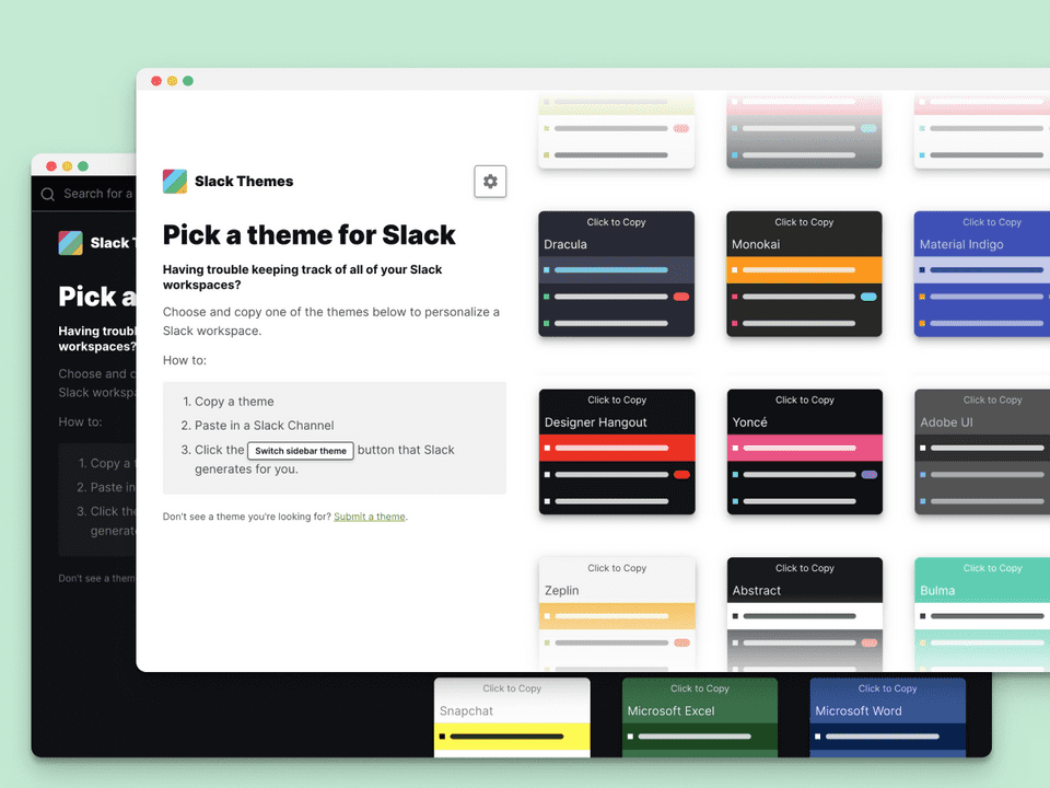
Slack Themes Web App
A customizable, web-based interface that allows users to browse and preview themes and provide a way to configure themes to their preference.
- Browse hundreds of themes
- Toggle colors on each theme
- Access themes from a Slack command
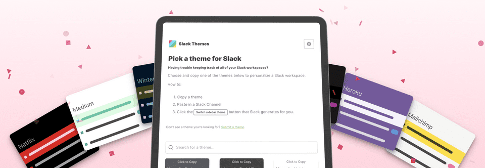
How was it built?
As a personal project, I thought it would be great to use this as an opporunity to learn how to build a simple product using some modern design/development tooling. Not only that, but I could build a process of user research and feedback from the start. This project was built using:
- Figma
- Google Forms
- Firebase
- React
- Styled Components
Letting users customize
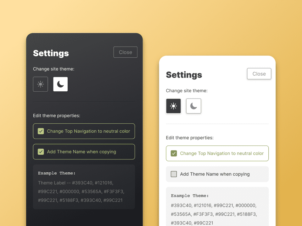
One of the goals of for this product was to retain simplicity - it needed to provide enough features to create customizable points for users, but not so many to bubble unnecessary points of friction
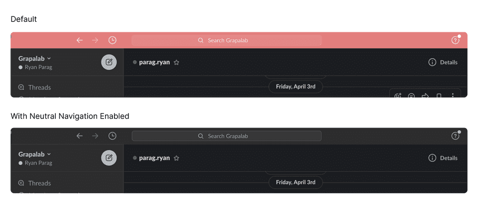
One area where I saw a need for users to toggle was for Slack's top header color. Some users may find brightly colored headers intrusive and distracting. As such, I thought it could be useful for users to toggle this part of the theme On/Off; where if it was on, it would paint the header the same color as the sidebar background, and if off, would use the active color of the theme
Designing for flexibilty
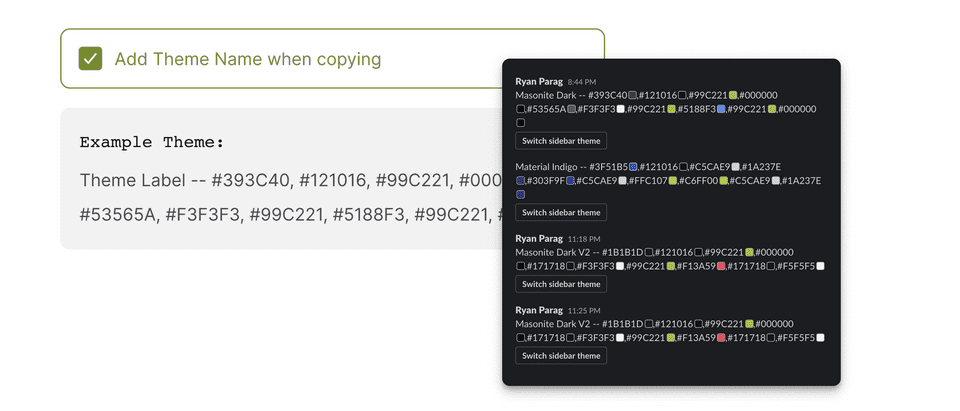
What if a user wanted to know the theme name when sharing a theme in a Slack thread?
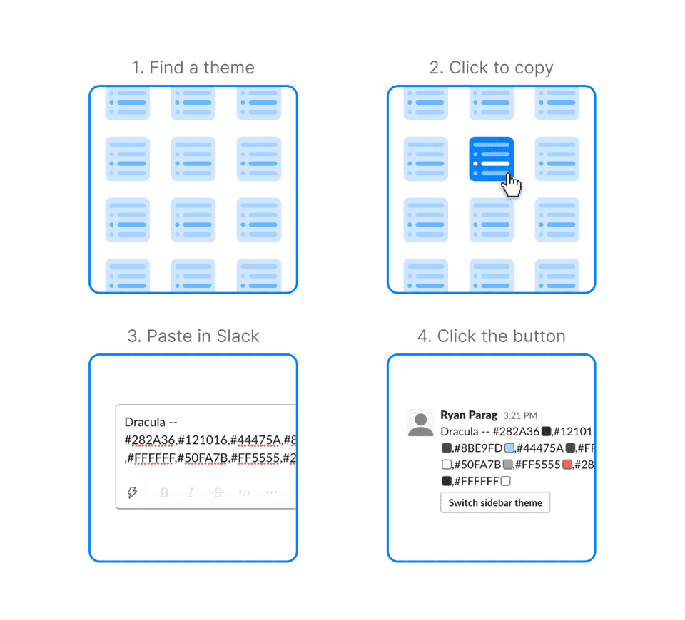
What if a user wanted to paste a theme directly in their preferences?
Sometimes, a user may choose to share theme to others in a Slack channel. In those instances, where there could be many themes populating a screen, it could be helpful to differentiate them by label.
Other times, a user may be pasting a theme directly in their preferences, where there is no need for a theme to be labeled.
To help circumvent these inconveniences, users could toggle the addition of the theme label before copying a theme
Feedback for the future
Response for the basic functionalities of the app seemed to be great. Seeing how users were interacting and copy/pasting themes helped drive new features onto the roadmap (like the upcoming Slack command 💯).


💡 Takeaways and Next Steps
Embrace Ambiguity: Moving forward without knowing all the answers. Always be conciously curious and proceed forward with the best intentions. Keep thinking and pushing new ideas.
Build incrementally: Rather than large sweeping changes to the product, I seemed to experience less change aversion when introducing features incrementally in small bits.
Moving to a Slack app: Instead of browsing through a web app, could we let users query using a command directly in Slack?
(It's on the roadmap 😎)
Letting users filter: How may users filter things categorically in the interface? For example, if a user only wanted to search for dark themes.
(This is on the roadmap too 💯)
Thanks for reading!
If you'd like to see more work, head back to view all work or check out one of my selected projects:
Back to Work