Overview
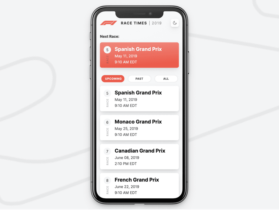
A small, personal side project to try and create the easiest way to track Formula 1 races per my local time zone.
Figma, CodePen, Atom, GitHub, HTML, SCSS, Javascript, Notion, Google Forms, Ergast Formula 1 API
Millions of people, from a variety of time zones, tune in to watch the next Grand Prix every other Sunday (or Saturday night, depending on the time zone). But scheduling a fixed time to watch on race day is difficult due to:
- Different race locations for each Grand Prix
- Worldwide viewership
- Varied race time in the race location
- Difficulty in finding the race time translated per the user's time zone
- Unlike a national sport, such as the NFL, set times are a bit more difficult to schedule for Formula 1.
In order for a viewer to gauge when the next race will be, they either have to dig past multiple clicks on the official Formula 1 website/app, or utilize Google Search for realtime updates on the searched race.
How might we give Formula 1 race fans the ability to quickly discern the time of the a race in their time zone?
Scenario Goals
Now that I had nailed down some of the MVP features of this tool, I needed to start putting pen to paper and ideating upon the scenario goals. While there is no real or current business need, I could still utilize the Lean UX method to wireframe, test, critique, and prototype this idea. I wanted to have each goal of this app to be able to:
- Empathize - understand the target audience
- Ideate - sketching and sharing my ideas often
- Design - organize the loose ideas from step 1 and 2 and get user feedback.
Initial Wireframes
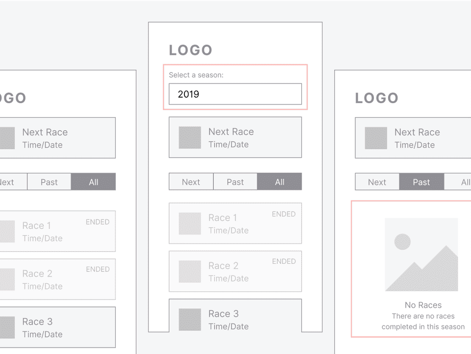
To not waste too much time, I crafted a few simple wireframe layouts that would help map the user’s path of inquiry. After a quick round of initial research, I found that users simply wanted to see the time and date of the next upcoming race. Tests that ran well showed the race calendar inside of a list view rather than multiple cards in a single row. A simple tab component was included to help filter the selected season's races and generate the update within the list view.
Design System
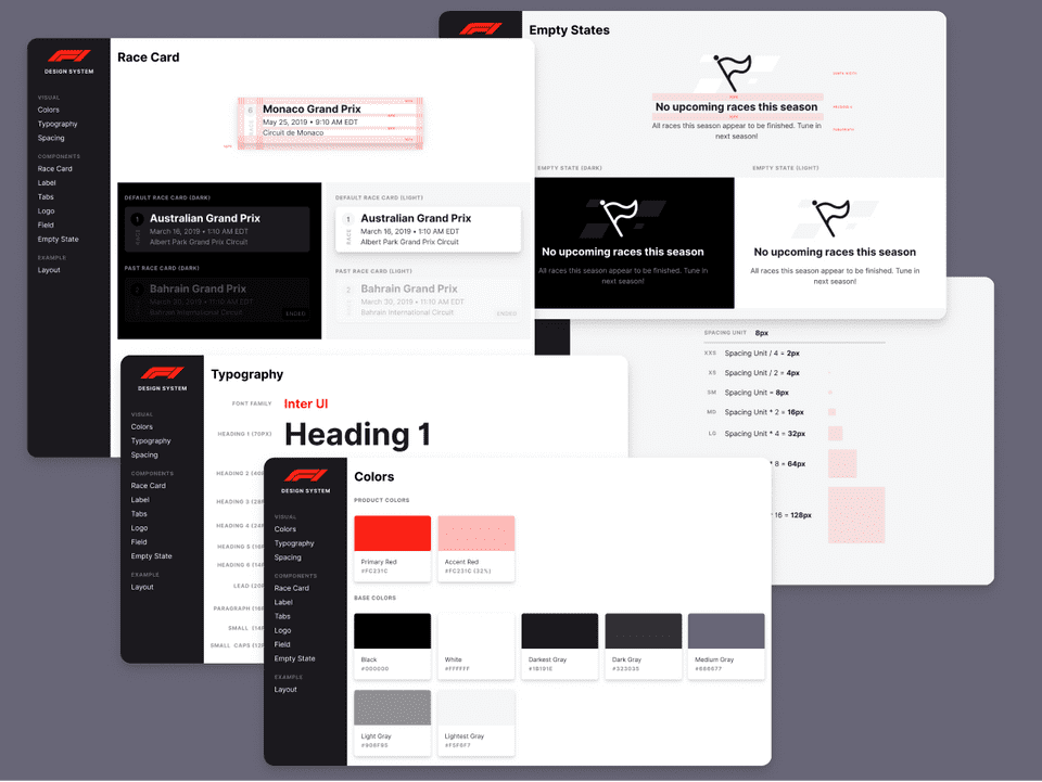
After looking through a few wireframe ideas, I took inventory of what components and foundational UI I would need in order to begin a build out. Using Figma, I began documenting the design tokens and used them to start building the components within the design tool.
I wanted to stick a familiar color palette and create a seamless experience with the Formula 1 brand, so I based the color system from Formula 1's revamped brand guidelines. By using Inter for typography, I could help ensure legibility throughout the app and have a wide range of typographic control. A huge thanks goes out to all of the awesome contributors to the Inter project.
My end goal of the design phase of this project was to have Figma design assets, design guidelines, and react & CSS components - helping for a more rapid development process when other features may be added in the future.
Design & Build
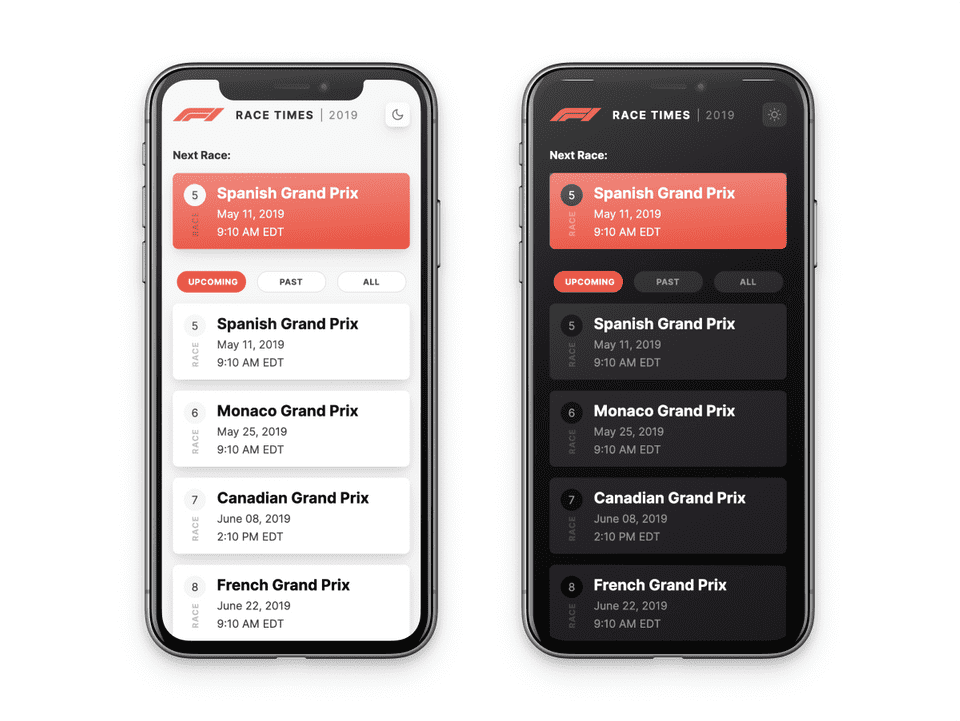
Using the wireframes, high-fidelity mockups, and design notes, I set out to create a simple tool using HTML (PUG), SCSS, and Javascript. By connecting to the Ergast Formula 1 API, I could gather realtime data of races and seasons.
In the early feedback sessions with F1 fans and non-F1 fans, I found that color contrast was causing usability issues for users quickly scanning the race list. To rectify that, I audited the design against a11y standards and made background/foreground/text color changes that would meet AA benchmarks. In a subsequent and quick feedback session, the same group of testers found it much easier to scan and differentiate UI elements more easily than in their previous round of feedback.
Selecting Seasons
One of the early feedback sessions found that users might want to:
- See if a track from a previous season was in the current season (or vice versa)
- Compare the number of races this season versus the number from a previous season
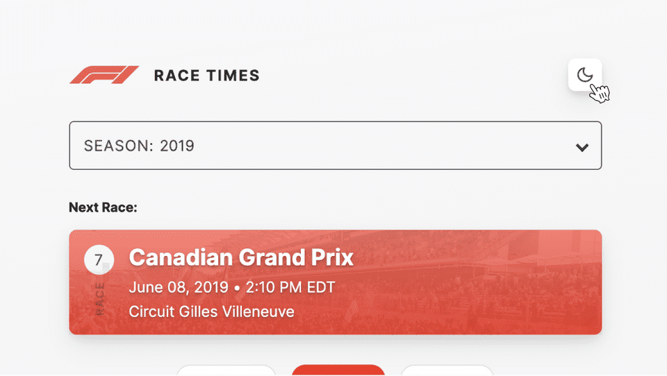
To give users the ability to accomplish these needs, I implemented a season selection that would let users select a season from the past 20 years and view their currently selected season. Users are able to select a season from the dropdown - thereby re-generating the list of races.
Dark Mode
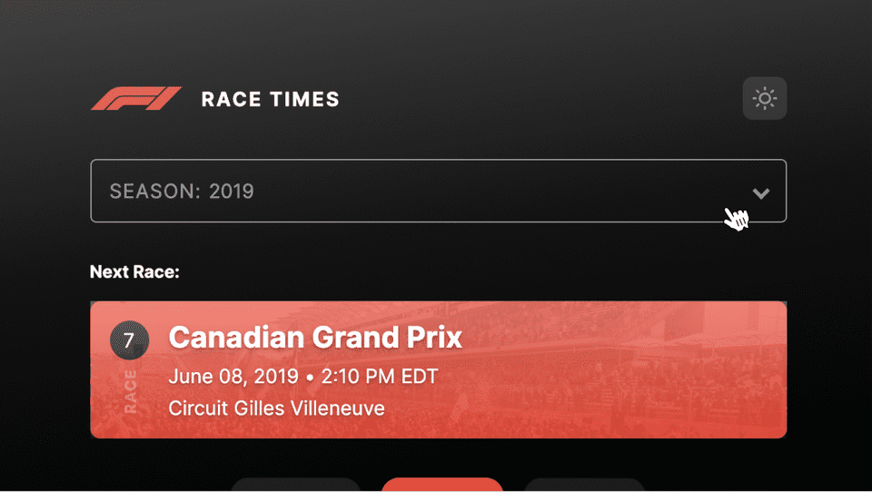
Let's face it — some F1 races are early 😴. Viewing a very bright UI in a dark environment might be hard on the eyes, so I thought to implement a dark mode that can be toggled. Also, I'm a sucker for dark modes 🤩 (in case you didn't guess from the dark mode in this portfolio).
By using mapped design tokens, in the form of some modern css (CSS custom properties), users may be able to toggle between light and dark modes.
Filtering Races
Sometimes, users may want to see races in relation to each other. By the law of common region, we can define three categories for races:
To help users categorize races in familiar patterns, I implemented a tab bar to categorize a season's races. Users may use the tab bar to quickly filter between upcoming and past races in the currently selected season. If they wish to view the full season calendar, past races will be visibly faded in order to differentiate between past and upcoming races.
Empty States
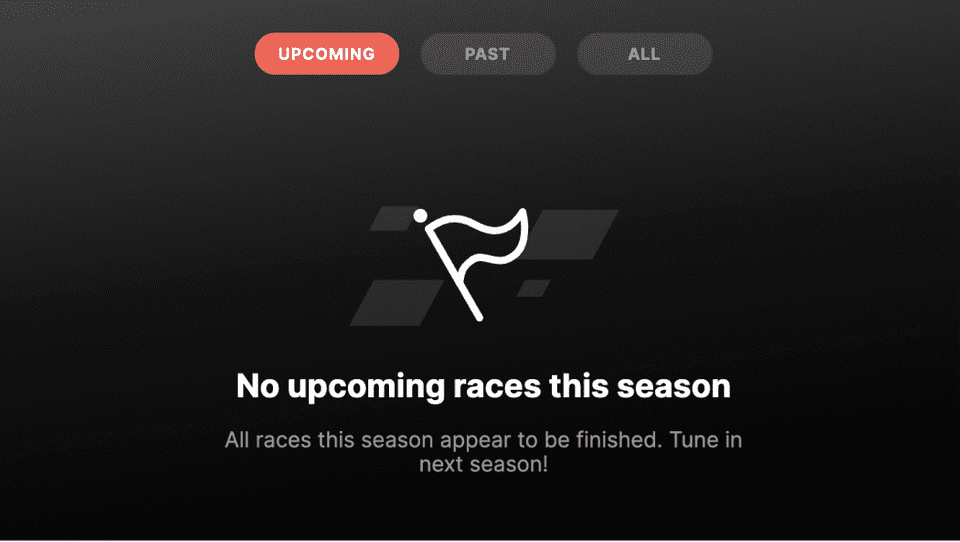
We needed to design an empty state to inform users if there are no races in their selected category. For example, if a user has selected a past season, there would be no upcoming races in that season - thereby rendering a empty state.
If there are no past or upcoming races when a user selects the respective tab filter, an empty state eill be generated - prompting the user to change their selection to an option that may contain filled data.

💡 Takeaways and Next Steps
Research should inform the design: When starting this project, I tended to make design assumptions and stuck to them — leading to incomplete design outcomes. Greater success came when I learned to reiterate the design goals and test patterns with users more granularly, rather than large sweeping changes.
Empathize more: Even though user feedback was collected, it is always helpful to spend more time understanding what the user needs.
Sharing and research: Even if the number of research participants was small (~9), it gave me a a greater understanding of how some F1 fans (and even non-F1 fans) might use this feature. In the future, I should think about a reaserch framework to help rapidly test new features as well as find a way to test among a greater number of participants. Forums? Reddit groups?
React, like the cool kids: Even though this project is fully functional in live code, leveraging a modern tool, like React, will help make this application simple to build upon by being incredibly component-friendly.
Thanks for reading!
If you'd like to see more work, head back to view all work or check out one of my selected projects:
Back to Work