Background 📋
While there is a lot of innovation going on in the market around the front door, there is little innovation being introduced by door manufacturers.
Video door bells and smart locks have experienced rapid growth and are expected to double within the next 5 years, driven by trends in connected home, IoT and growth of Airbnb and managing access. However, the products in the market today come with tedious workarounds and pain points.
Masonite has developed a product concept that it believes has solved several pain points in the market and differentiates it from competition. By providing a power to the door system, Masonite has developed a concept where technology can be integrated into a door with options for both a Masonite relationship (account, app) and 3rd party integration (Ring, Yale, etc).
Users need a way to manage and control a powered and connected door conveniently with their mobile phones and with their home automation applications.
user research, wireframing, prototyping, interaction design, usability testing, visual design, front-end development
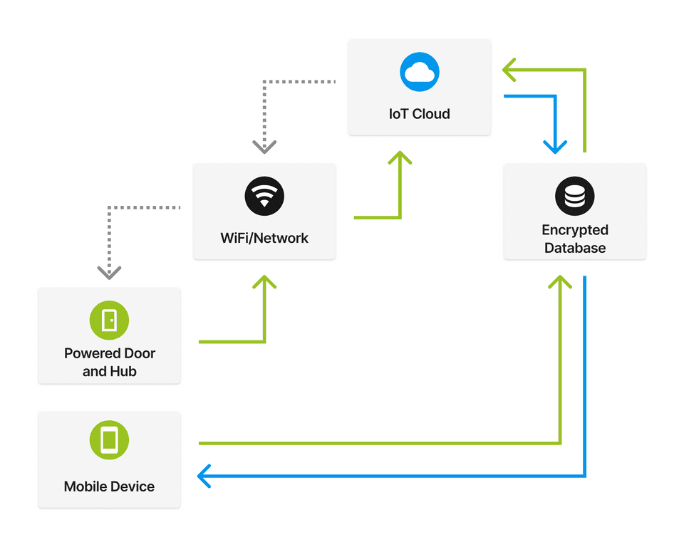
This project was complex, and as such, requires multiple teams to manage - we needed to build a door that is directly powered from a home, as well as have a mobile app & IoT infrastructure to support the embedded features.
While also juggling a few other projects, I was also the sole designer on this new project - working between 3 software engineers, a hardware engineering team, a business & marketing team, and a handful of PM's managing different facets of this project.
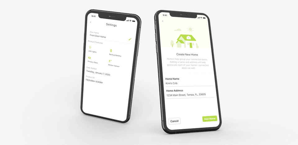
Discovery & Research 🕵️♀️
This project is complex and would require a heavy amount of research. We needed a research framework that would help us diagnose our users' needs and validate what we could breakout into build phases.
With the success of the other projects utilizing UX research-backed process (Door Configurator, Advisar), we decided to start this project off using the Google Ventures' Research Process to help us validate our ideas.
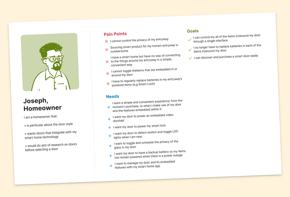
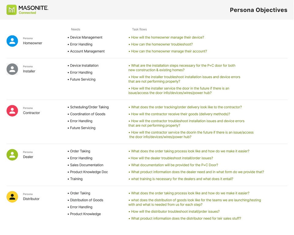
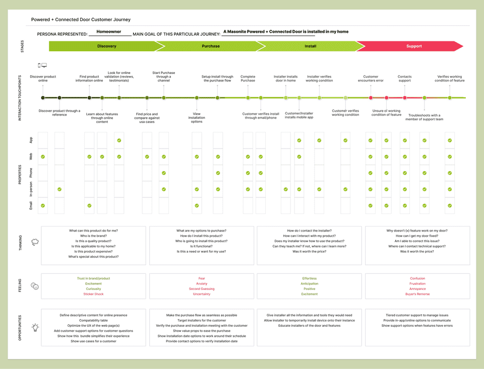
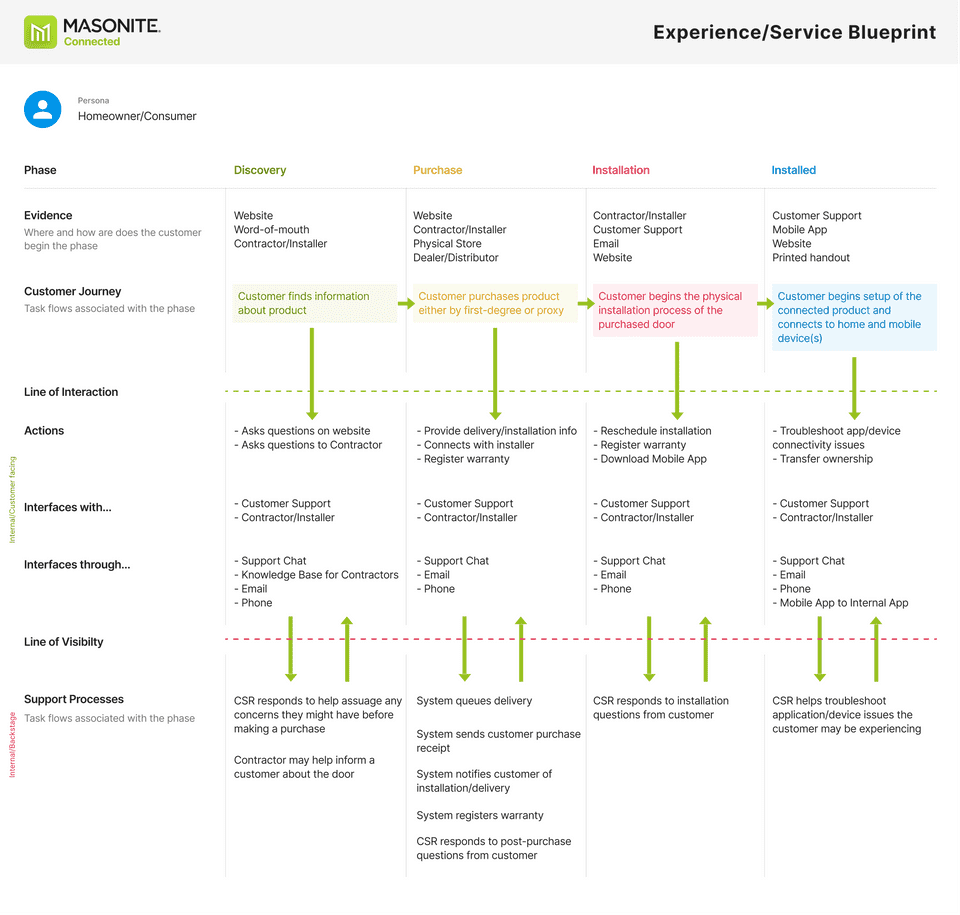
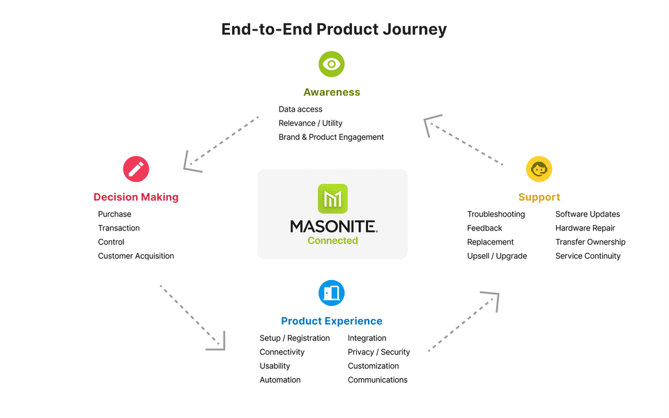
We began by drawing out our user journeys and personas, as well as mapping out which teams would need to be involved with the different ends of the product:
Goals 🎯
If users preferred using the app instead of using a home automation app to control the features in the powered door, we wanted the experience to be transient and quick - not wanting a user to have to dig around to perform a simple task. Our higher-level goals for the project at-large were:
To understand how different types of users control (and would control) their smart home devices connected to their door (e.g. smart locks, doorbells, etc.).
To understand the demographic of users who currently own and don’t own a Masonite Door.
Change the way consumers think about doors
Make discovering, purchasing, installing, and using a Masonite Connected door as simple as possible for users
We conducted remote market research interviews to help gauge perceptions and pain points of users who were in our demographic. Our research methods included:
After intial phases of the prototype, we went back and conducted user testing using Figma prototypes. Our research brought a few insights and impacts to light for us:
Insights and Impacts
Features ✨
To help streamline our process, we wanted to build a rough guideline that each feature would adhere to - for the users of this product, each feature should be:
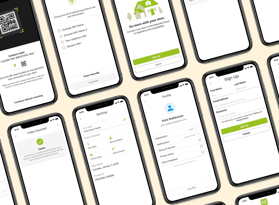
Based off of our research and current manufacturing constraints, we began seeing what features we could add to V1 of this product:
Battery-backup in case power is lost from the source of the home
Motion-activated LED lighting in areas around the door, providing accent lighting and the ability to see the key hole in the dark, which can also be managed on a Masonite app
Integrated design of powered smart locks and video door bells that no longer require changing of batteries and integrate into the 3rd party ecosystems
Ability to remotely know if your door is open or closed
Future features include smart glass which provides natural light at all times and privacy at the touch of a button (or motion-activated), fire/smoke detection, & interior door line expansion
Design System 🎨
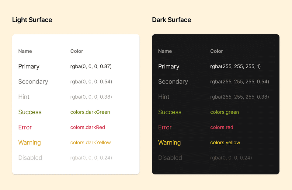
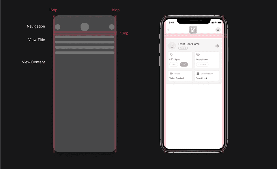
Since we're a small team (1 designer, 3 software engineers) and we're working on other projects in tandem, I needed to come up with a way of designing and documenting patterns rather than one-off prototypes of repetitive interactions.
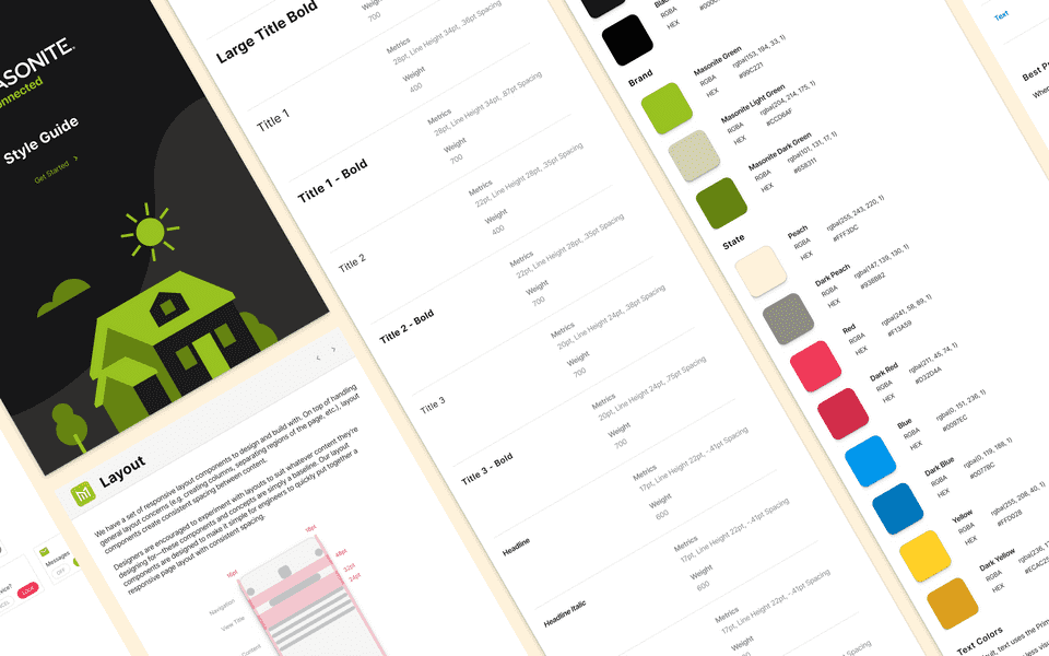
We wanted to get up and running with a prototype quickly, so we used Material V2 as a foundation for our UI - making slight changes to help provide a better experience for this product.
To help keep everything under a single, cross-platform design system, we abstracted styles (colors, typography, spacing) to feed into platform specfic components - and sticking to a few design system goals:
Foster platform familiarity
Document as much as possible
Build components around use cases
We also made sure our design system and components were built to accommodate scalibility, so components can work well alongside each other, at the same time, render well on various device resolutions.
Uncover actions and states 🕵️♂️
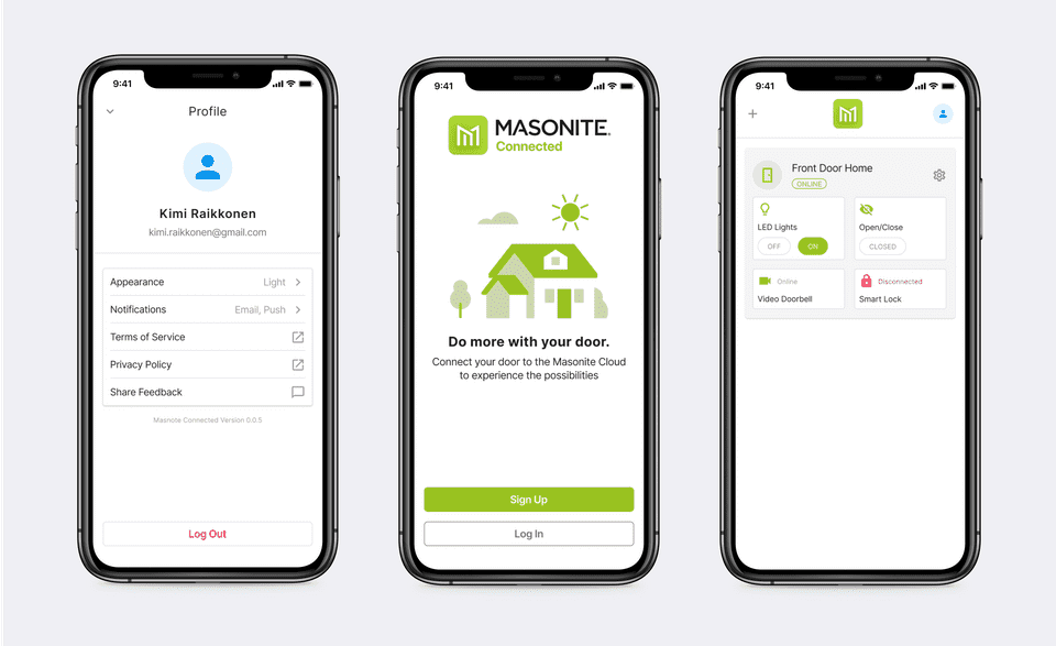
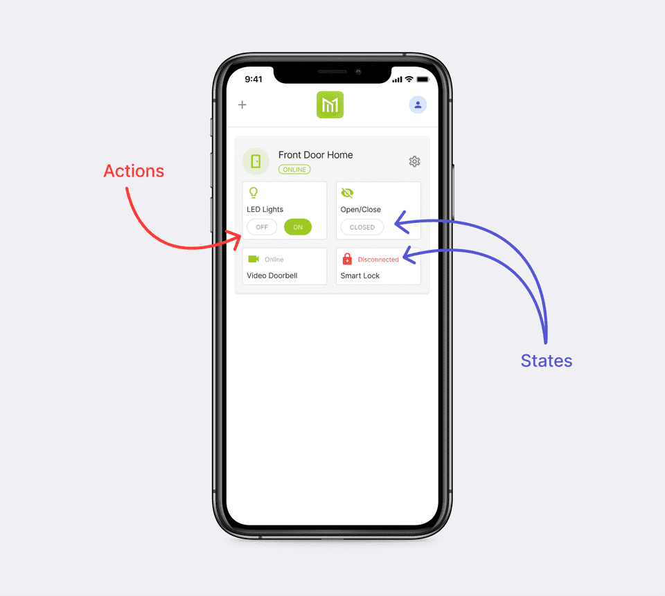
Opening a sheet every time to alter/view the state of a feature can quickly become annoying - so we wanted to expose these actions and state in the main view. By moving the action directly in the main view, we've:
decreased the number of taps from 2 to 1
provided a clear design affordance for each feature in a door
decreased the amount of time for a user to perform an action
Usability and Tap areas 👇
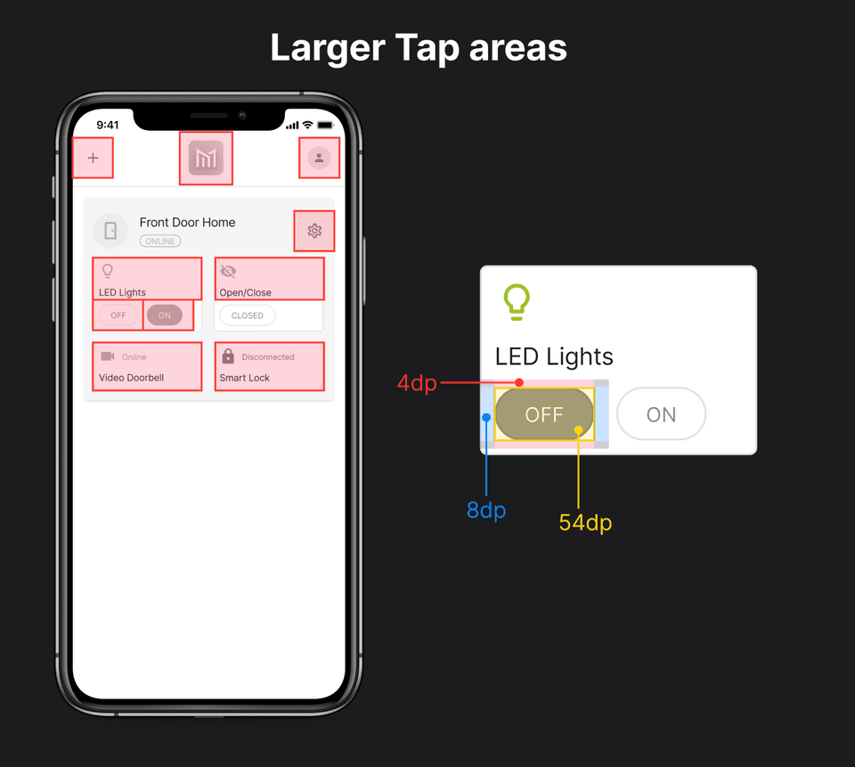
Through testing with prototypes, we discovered we needed to increase the size of the tap area on items with which users are able to interact - without having to alter the design of the component through the padding.
Depending on the component, we decided to add padding inside the tap areas, so users were able to easily tap lower-level components and decrease the amount of "undo" flows.
Error handling 🚨
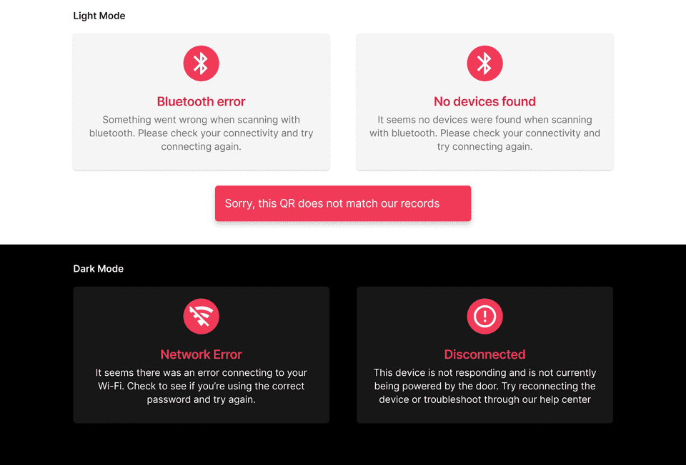
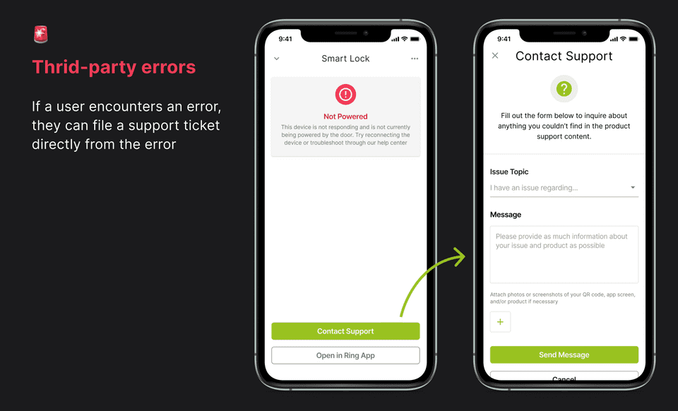
What if there's an error connecting to Wi-Fi?
What if there's a connection error to the cloud?
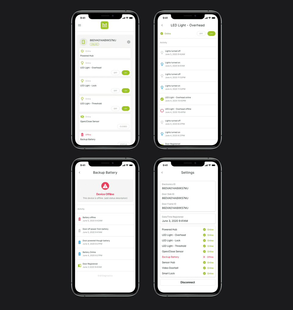
What if a device inside the door is offline?
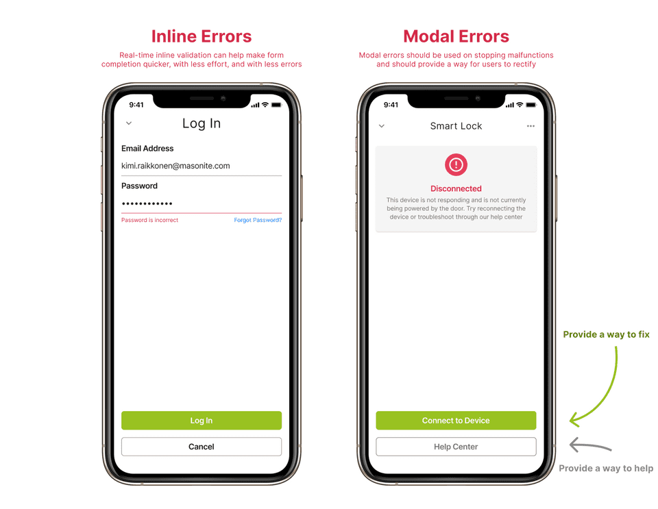
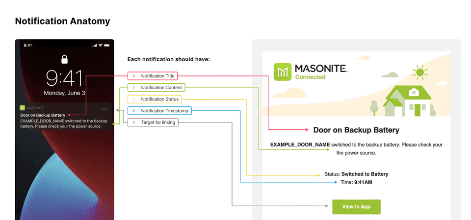
Depending on the severity of the error, users need a way to be able to see errors in realtime. When a device must interact with an IoT cloud to be able to interact with a hardware product, a slew of errors can occur - so we needed to depict each error in certain types of ways: Cards, Snackbars, Push Notifications, etc.
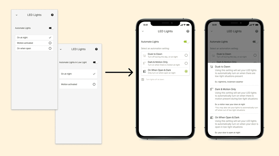
Automation options 🤖
We live in the age of automation, so users expect their digital and smart hardware products to be able to make their lives simpler by automatically reacting to events and doing things for their owners.
In this iteration of the product, the powered & connected door is able to automate when lights turn on/off:
Turn my lights on when it's dark outside
Turn my lights on when there is motion outside my door
Turn my lights on when my door is open
How can we let users select different automation settings on their door?
Platform Emails/Notifications 📱
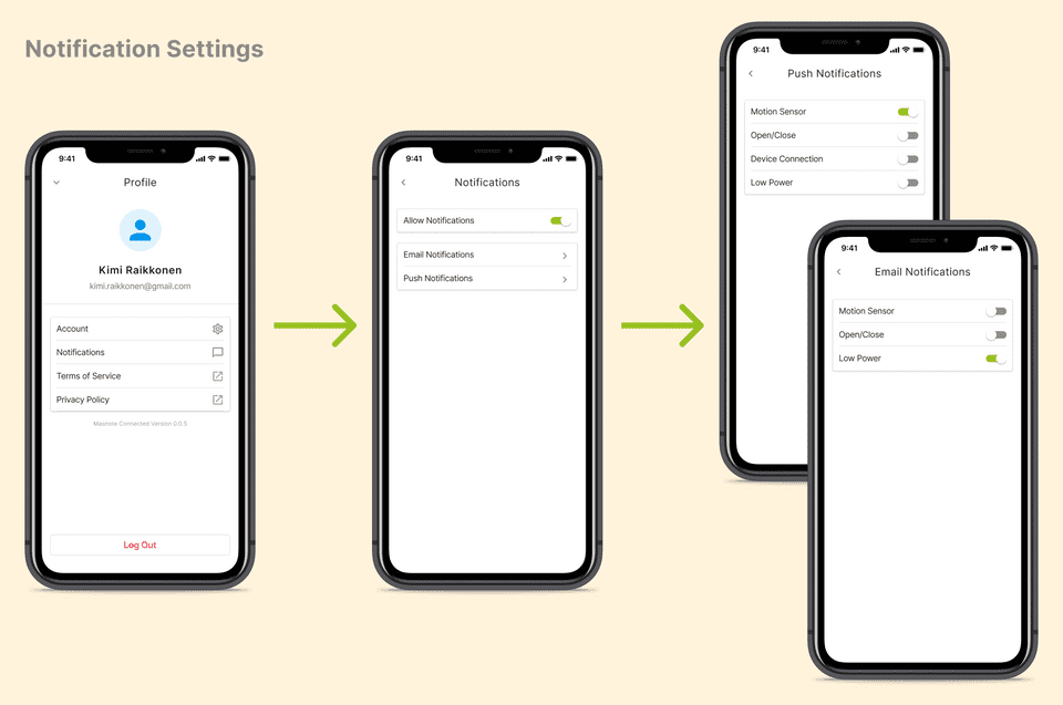
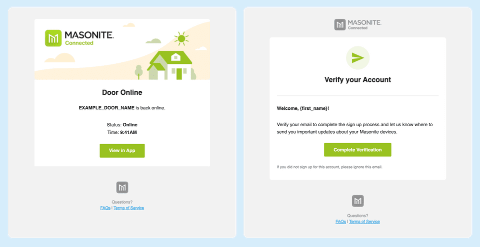
How can we communicate with door owners to let them know about events with their door?
We needed to build a way for users to manage which notifications they receive about their door, and how they receive them (Push or Email)? As a heavy email user, I love 🤩 looking at designs of platform emails and what other products choose to include. In our case, we don't want to overload the user with information - simply to inform them something happened at a certain time.
To help make sensible defaults for first-time users, we consulted our qualitative research interviews to see what priority users gave to certain door events, and how they expected to receive them.
Third-party products
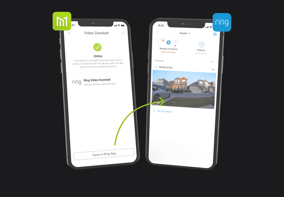
Possibly the largest innovation of this door is the ability to power your third-party entryway devices (eg. smart locks, video doorbells):
Can my door/home power my video doorbell so I don't have to change out the battery?
Can my door tell me when my lock is offline?
What's next? 🔮
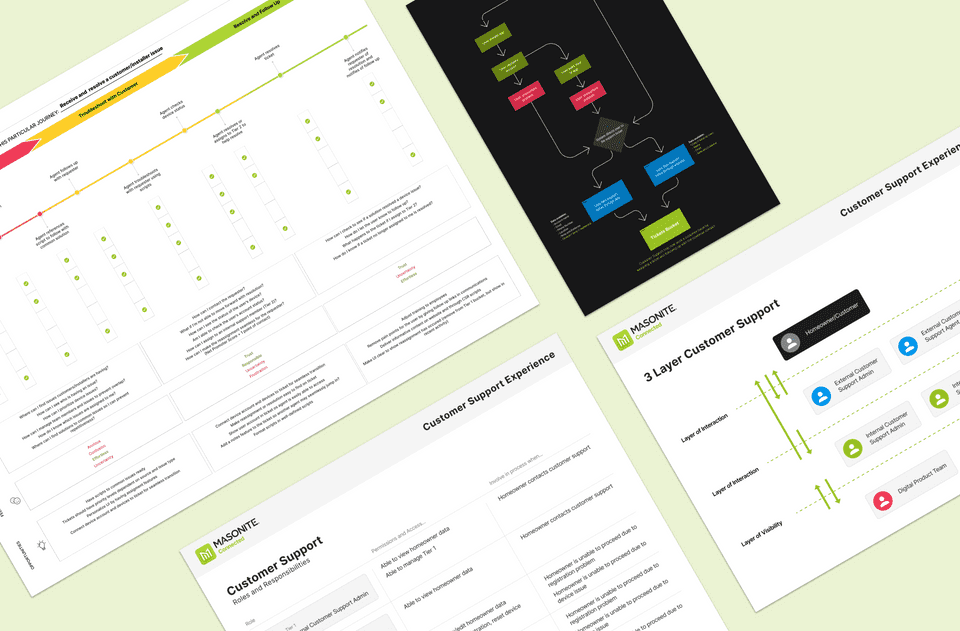
We're working on the tangiential products around the consumer/homeowner side of this mobile app and collecting research on the manufacturing/installing process of doors and electrical devices:
How can installers and manufacturing temporarily register to an IoT device and test the working status of a door at consumers homes' and manufacturing plants?
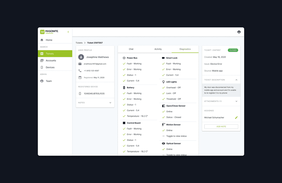
How can customer support representatives rectify issues a consumer may have with their product? (eg. viewing the working diagnostics of a consumer's door)
Upcoming
This project is still a work in progress, so check back for more updates
Thanks for reading!
If you'd like to see more work, head back to view all work or check out one of my selected projects:
Back to Work